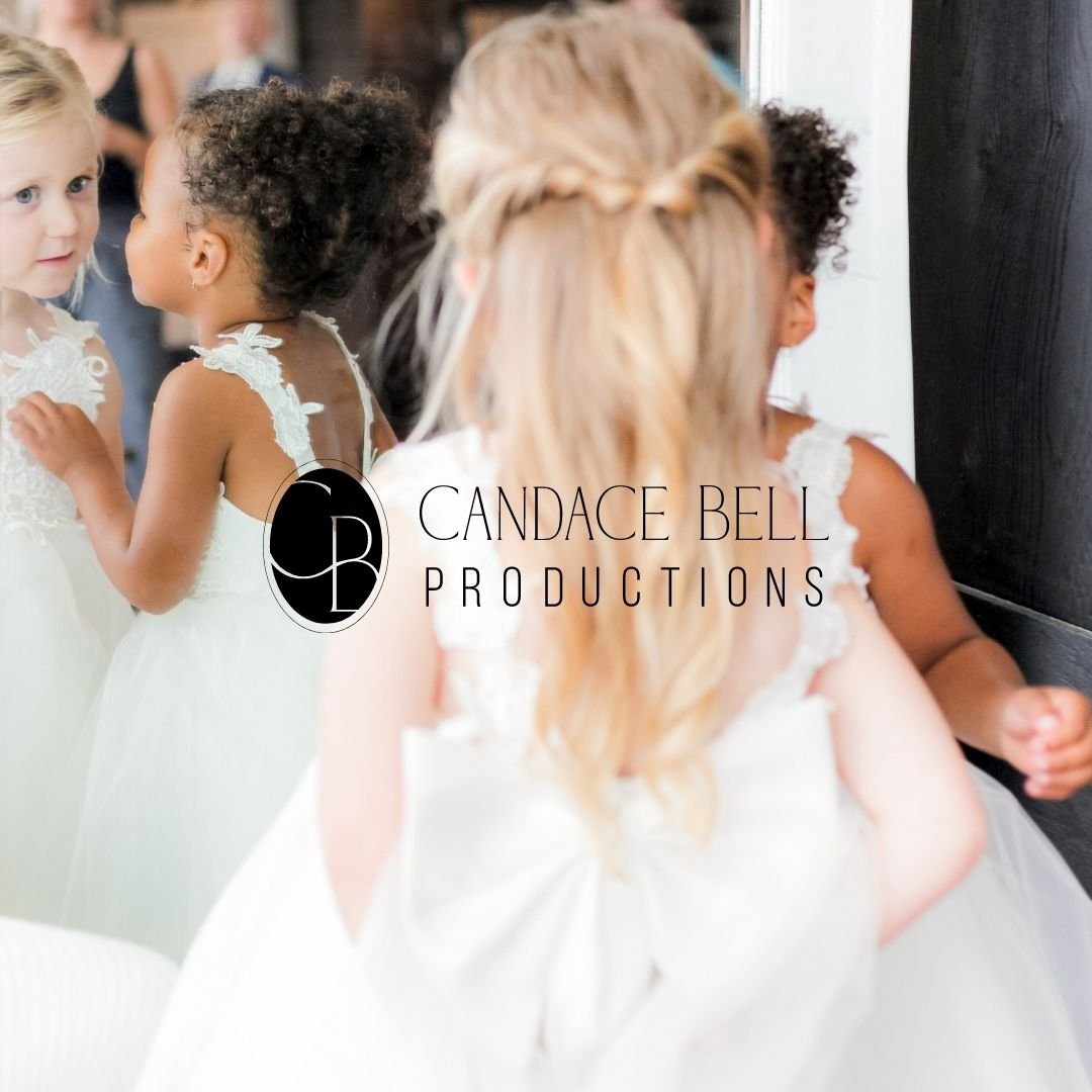
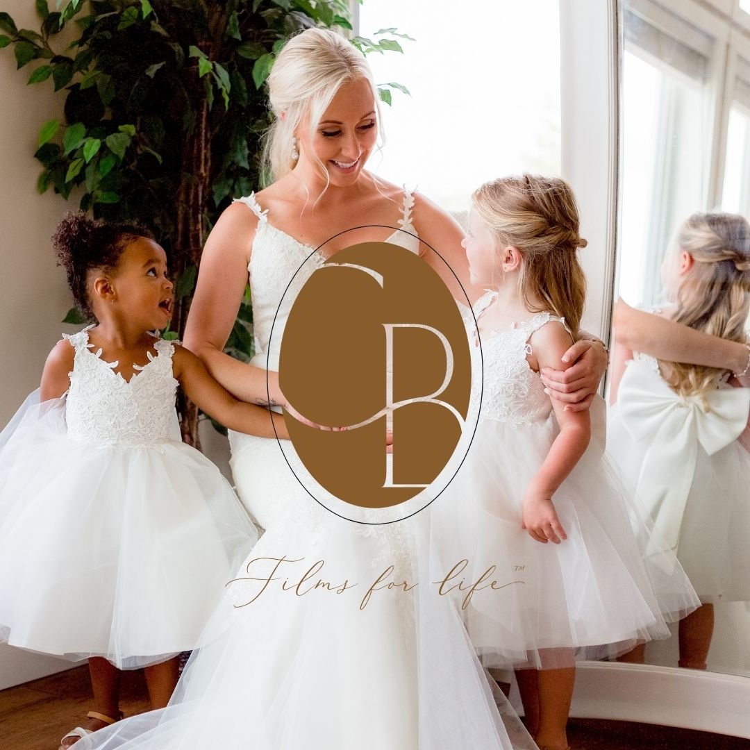
Candace Bell Productions Rebranding
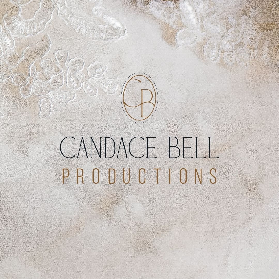
The primary logo drew direct inspiration from Candace's oval engagement ring. With obvious ties towards the wedding industry but also to the connection, endless memories, and eternity. There is a CB united within the icon itself, while allowing the eye to see a P for 'productions' as well, and unintentionally you can also see an R for Candace's maiden name. The characters are placed within the oval but not completed, utilizing the design principle of closure, where your mind completes the letters without them actually seeing them. Similar to many photos and films, where elements are off to the sides but you are still fully aware of what is being captured.
The placement of the ovals also captures the lens / focal point in which Candace is looking through for photography & cinematography. The fonts were hand selected to be timeless, both feminine and masculine. If you’re in the market for a talented cinematographer, be sure to connect directly with Candace Bell - she’s a true talent in the Ottawa Valley.