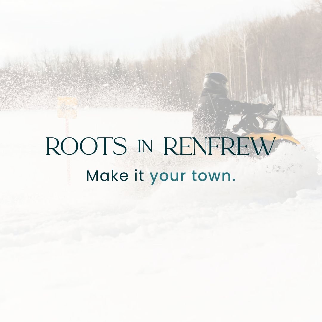
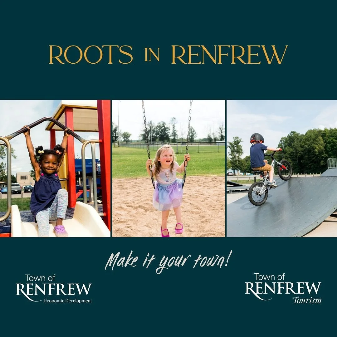
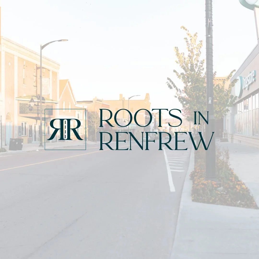
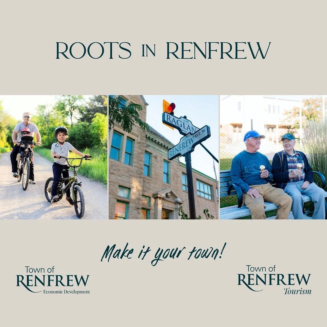
Roots in Renfrew Branding
Developing an iconic monogram with so many intentional elements to the design. The square enhances the notion of being grounded, setting roots and stability. It is also a nod towards Low Square in front of Town Hall. There is a road in the middle with four lines, representative of the imminent four lane highway expanding to Renfrew. The road also signifies expansion and driving the Town of Renfrew forward; as Mayor Tom Sidney says ‘change is coming.’
The double R monogram is attached to showcase the power of our community and connection.
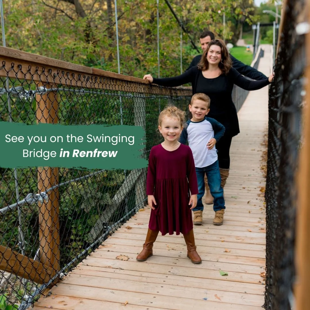
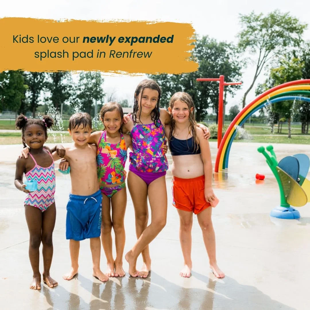
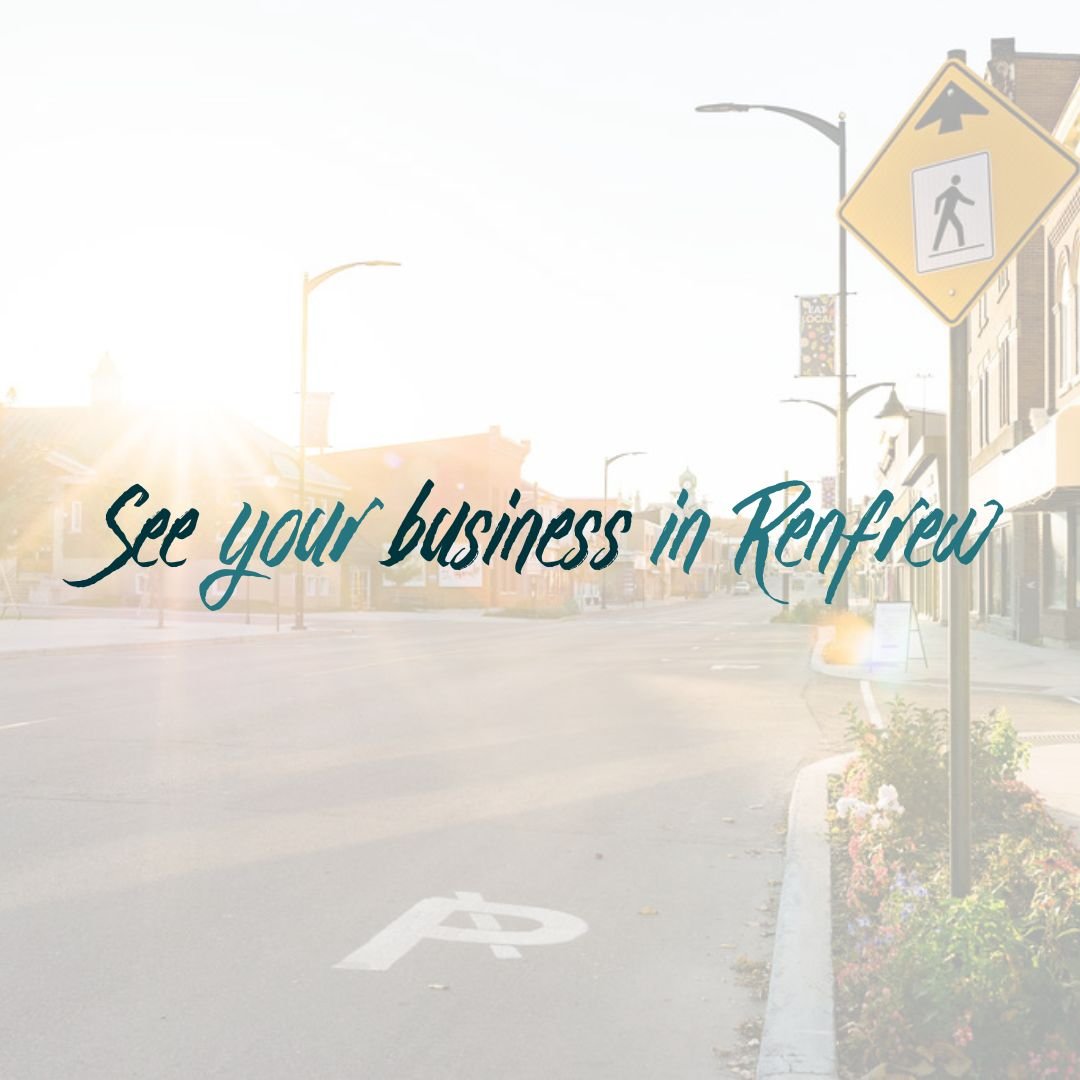
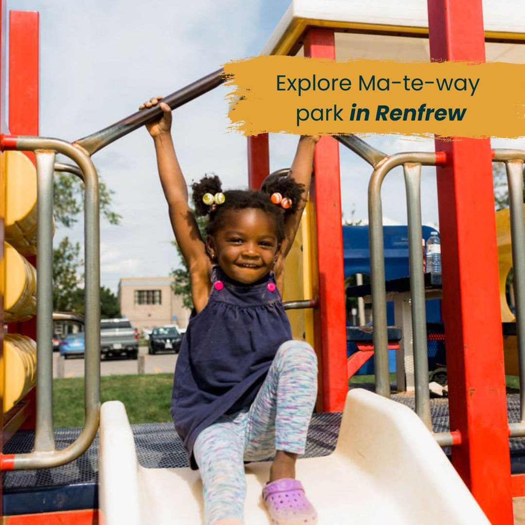
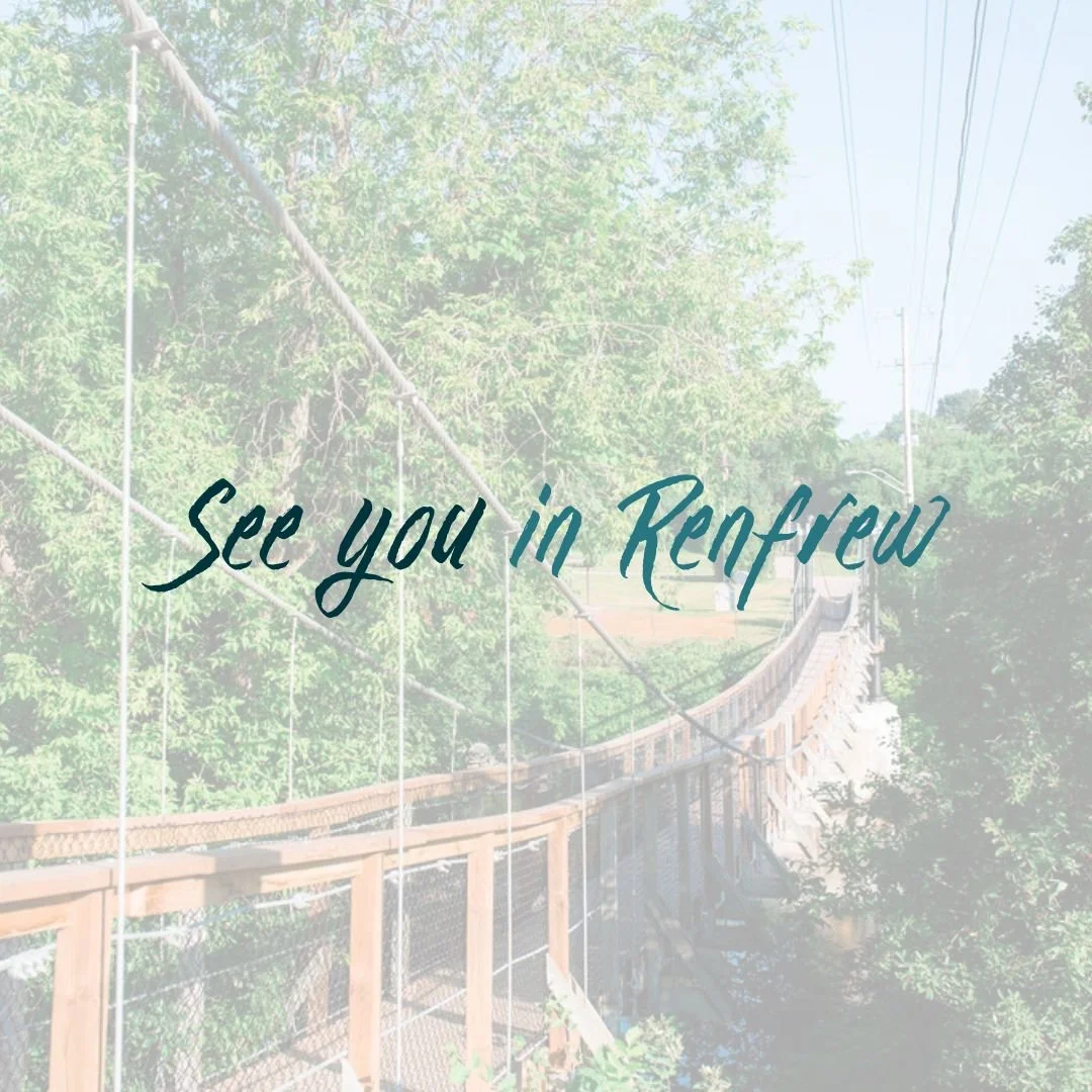
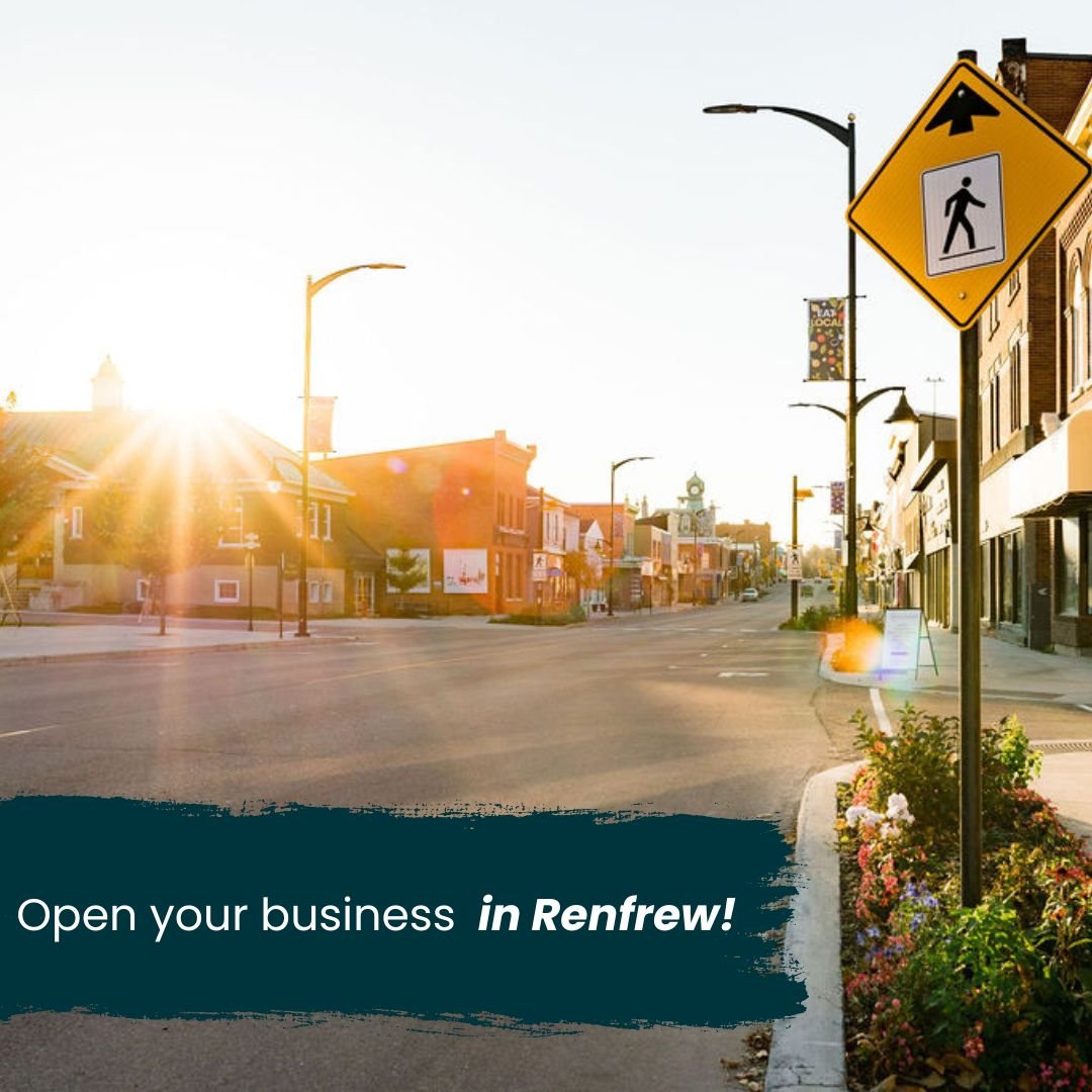
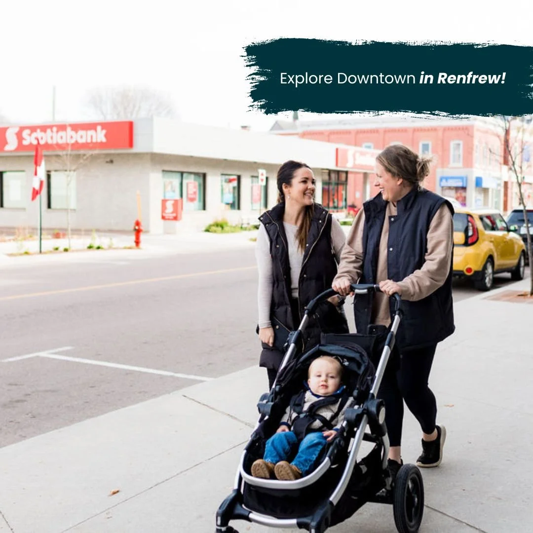
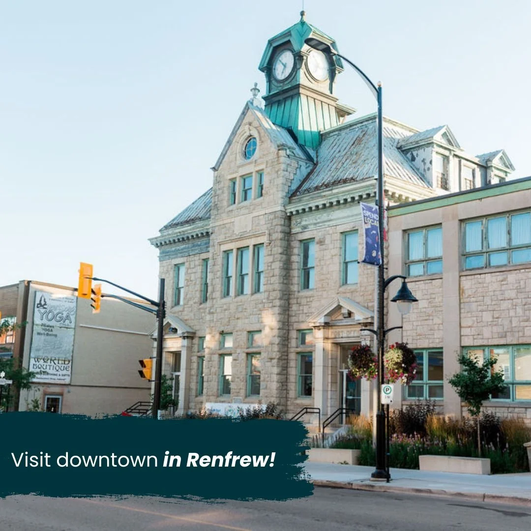
The marketing strategy developed ‘see you in Renfrew’ is streamlined to showcase what the Town of Renfrew has to offer and to help individuals envision their life, business or investments within the town.