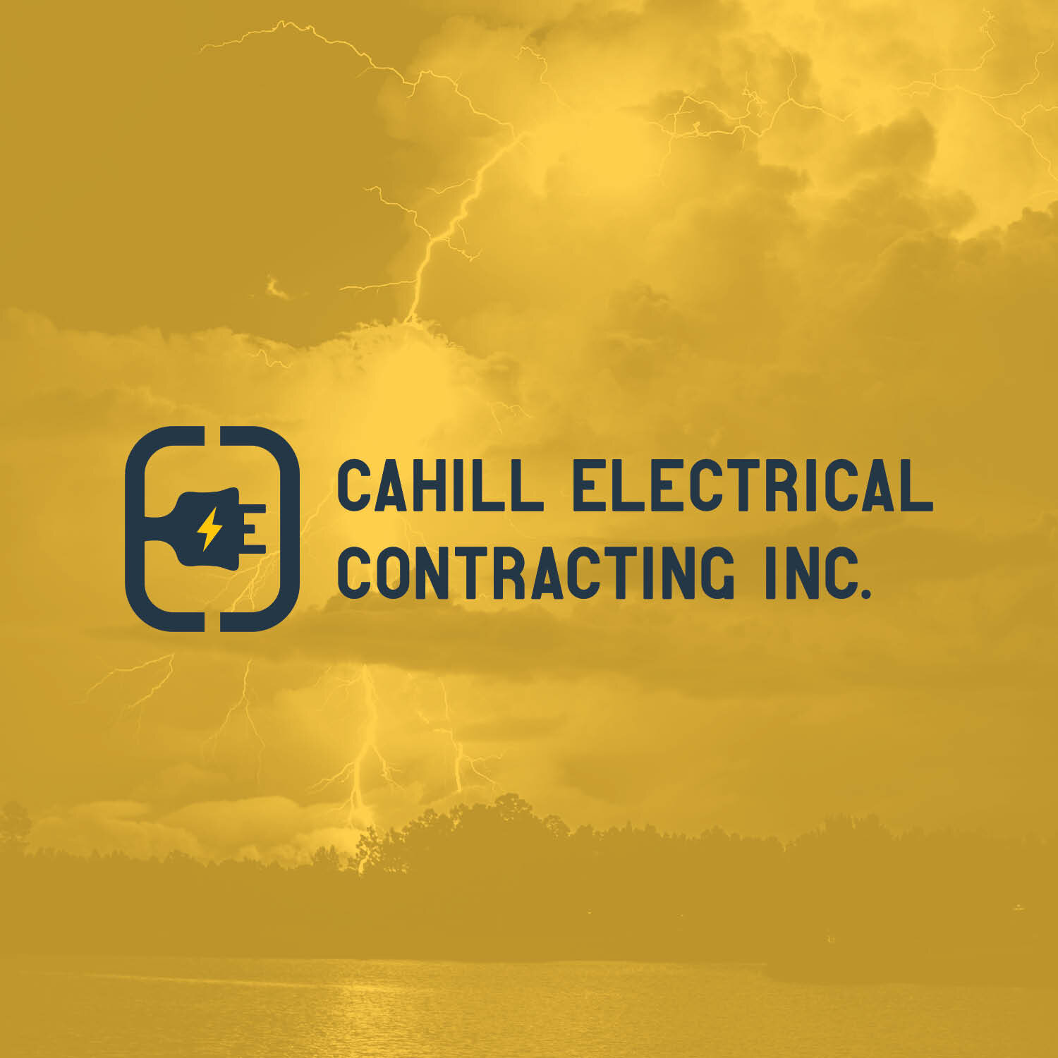
Cahill Electrical Contracting Inc. Branding
An electrical company that is run by two talented and hard working electricians, who also happen to be brothers. They both have high levels of certifications & qualifications to get the job done right the first time. We developed the icon by designing two ‘C’s that are thicker and represent the variety of cords and wires electricians utilize. Having the two shapes face one another, represents two brothers coming together and facing the business world. We created an ‘E’ in the middle with a bolt of lightning for power while the ‘E’ doubles as a power cable. The three representative letters in the icon are a nod to the business name and an abbreviation for CEC. Looking for talented electricians? Check them out at cahillec.ca, they come highly recommended by us!