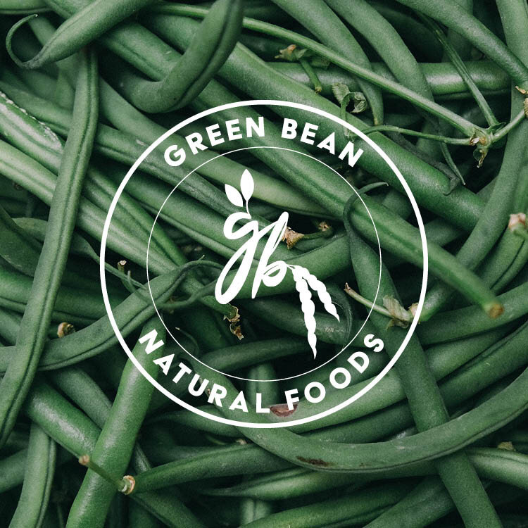
Green Bean Natural Foods Rebranded
We were entrusted to create a visual identity for this amazing store; their final files were inclusive of a fully branded one-of-a-kind logo set. The sense of growth and the natural look that this logo delivered, perfectly captures all of the amazing products they carry in-store. The staff are very knowledgeable and approachable and we wanted their logo to convey that as well. Of course we love hidden meanings, so there is an intentional reason for the inclusion of two leaves and two beans, but that’s an insiders secret!