
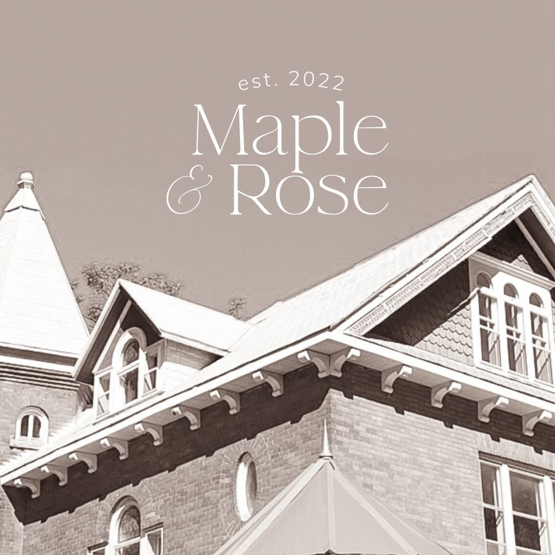
2023 Spotlight: The Project that left a mark on our heart - Maple & Rose.
↓Brand Photography captured by the talented Tania Blake ↓
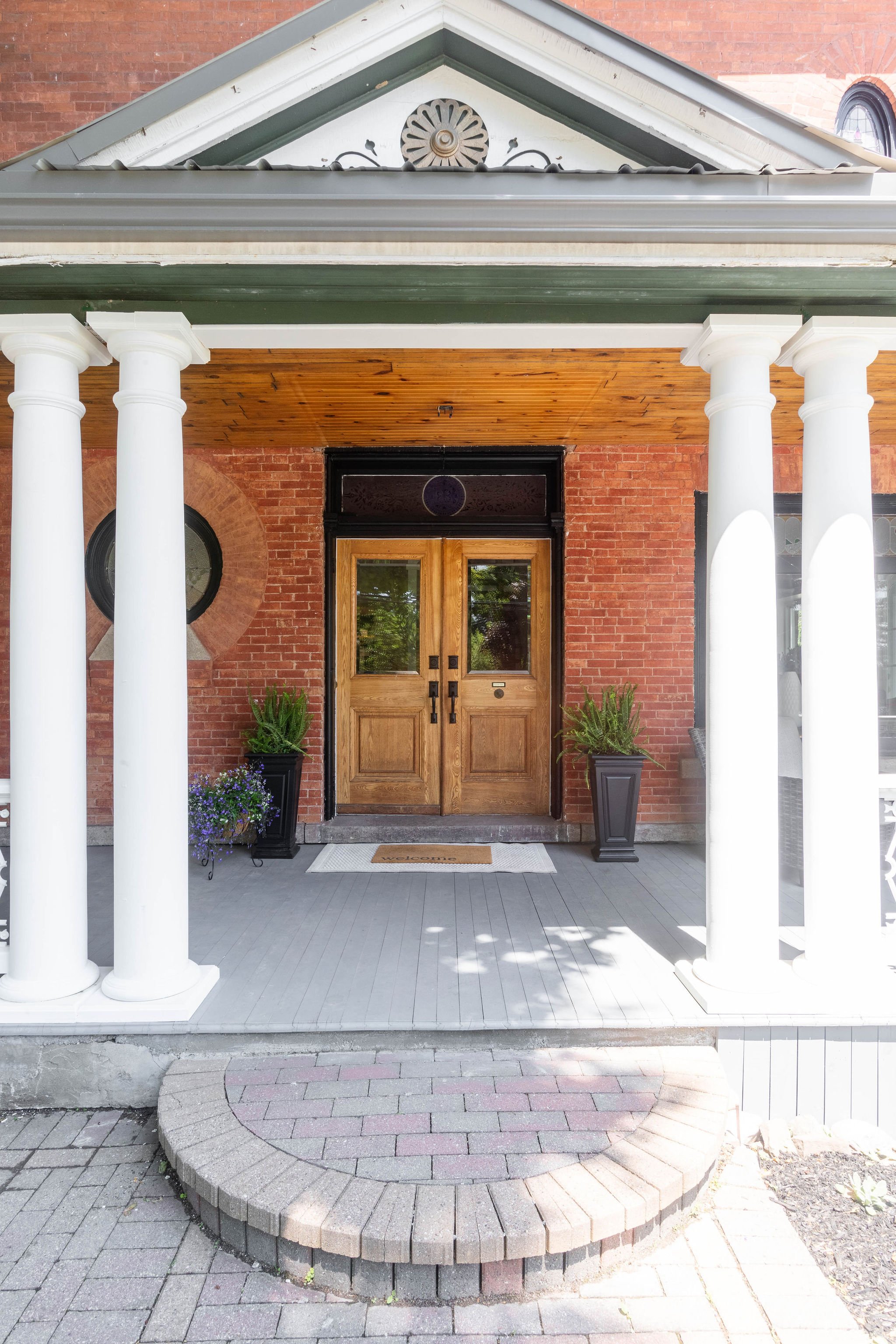
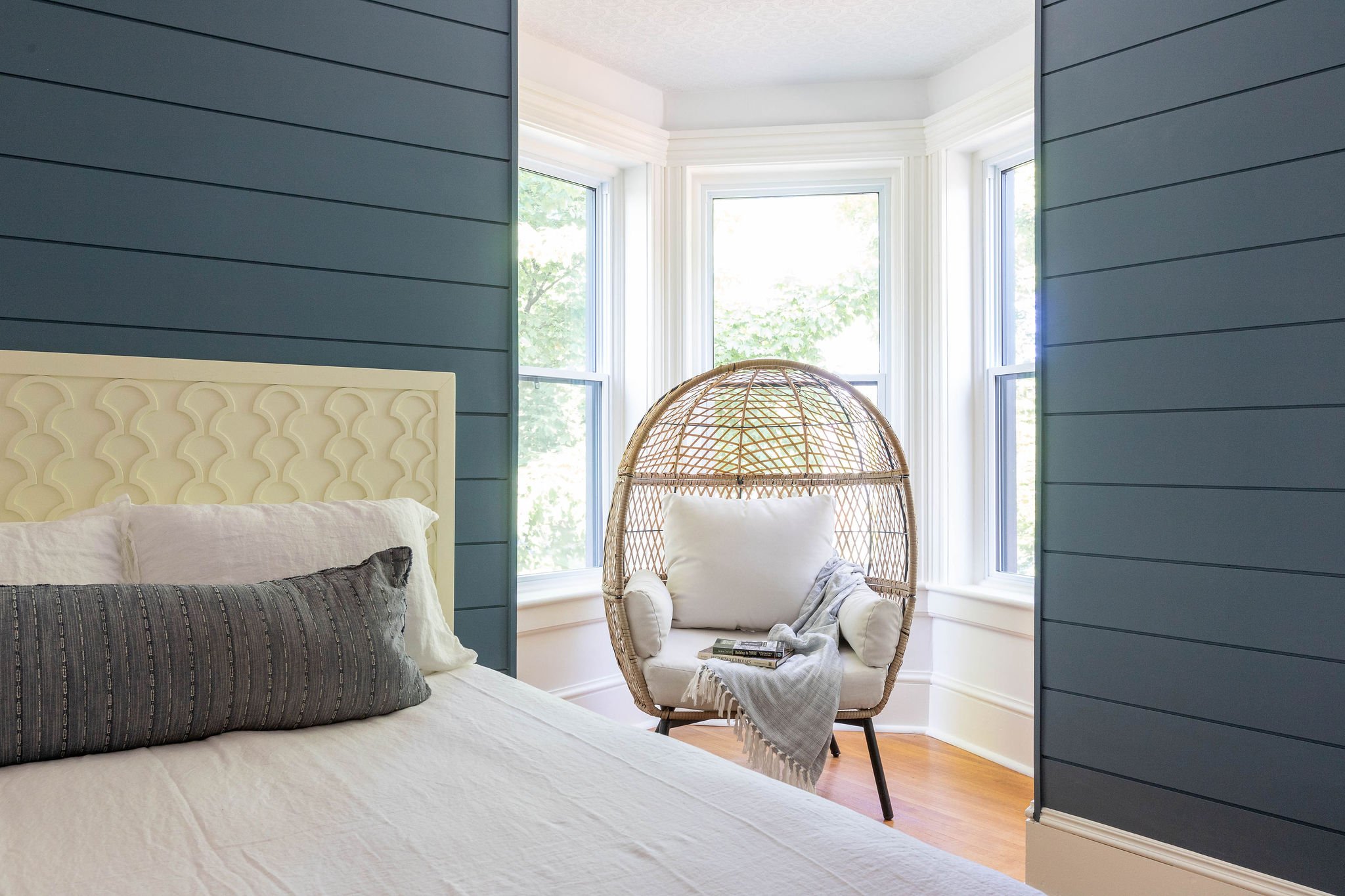
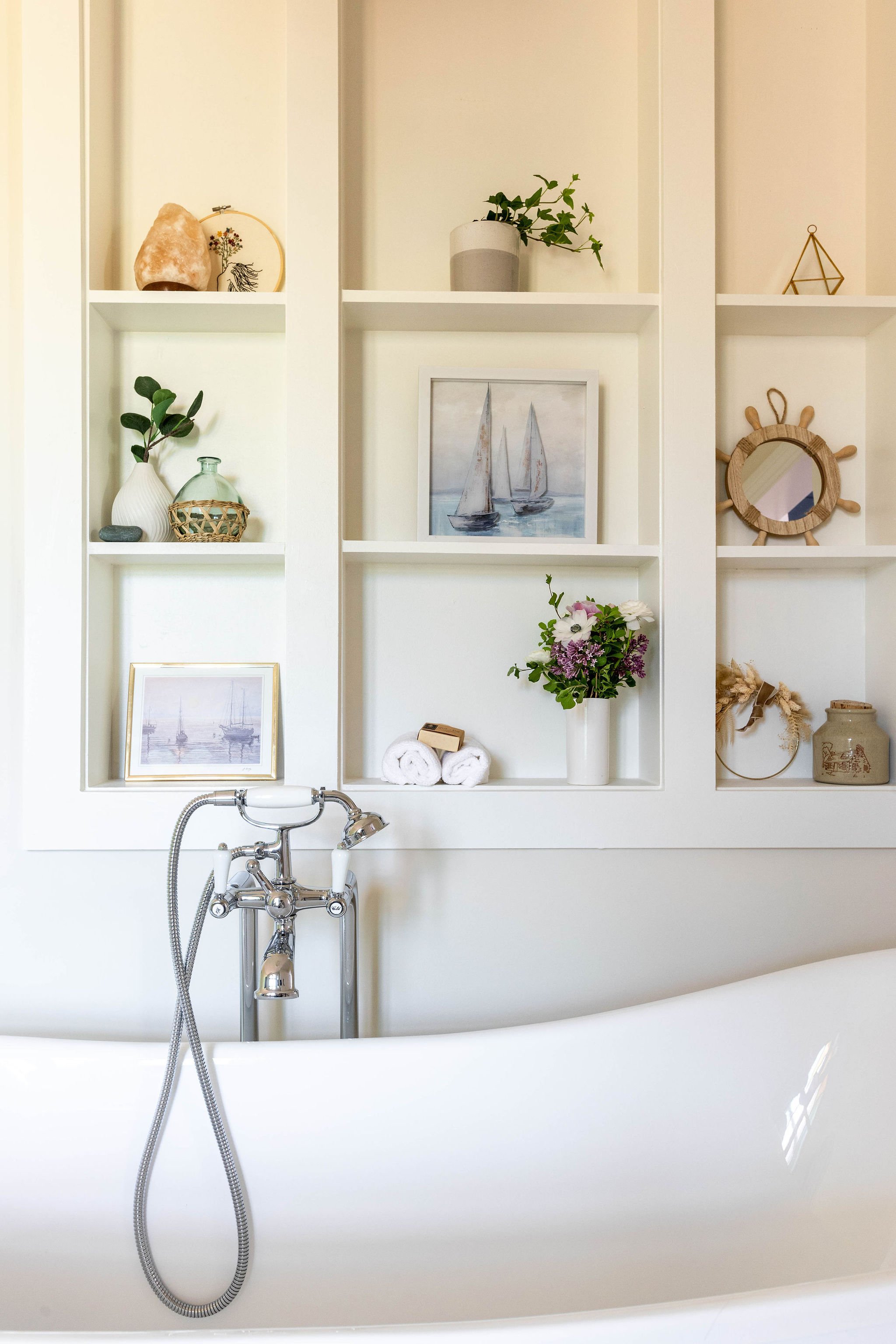
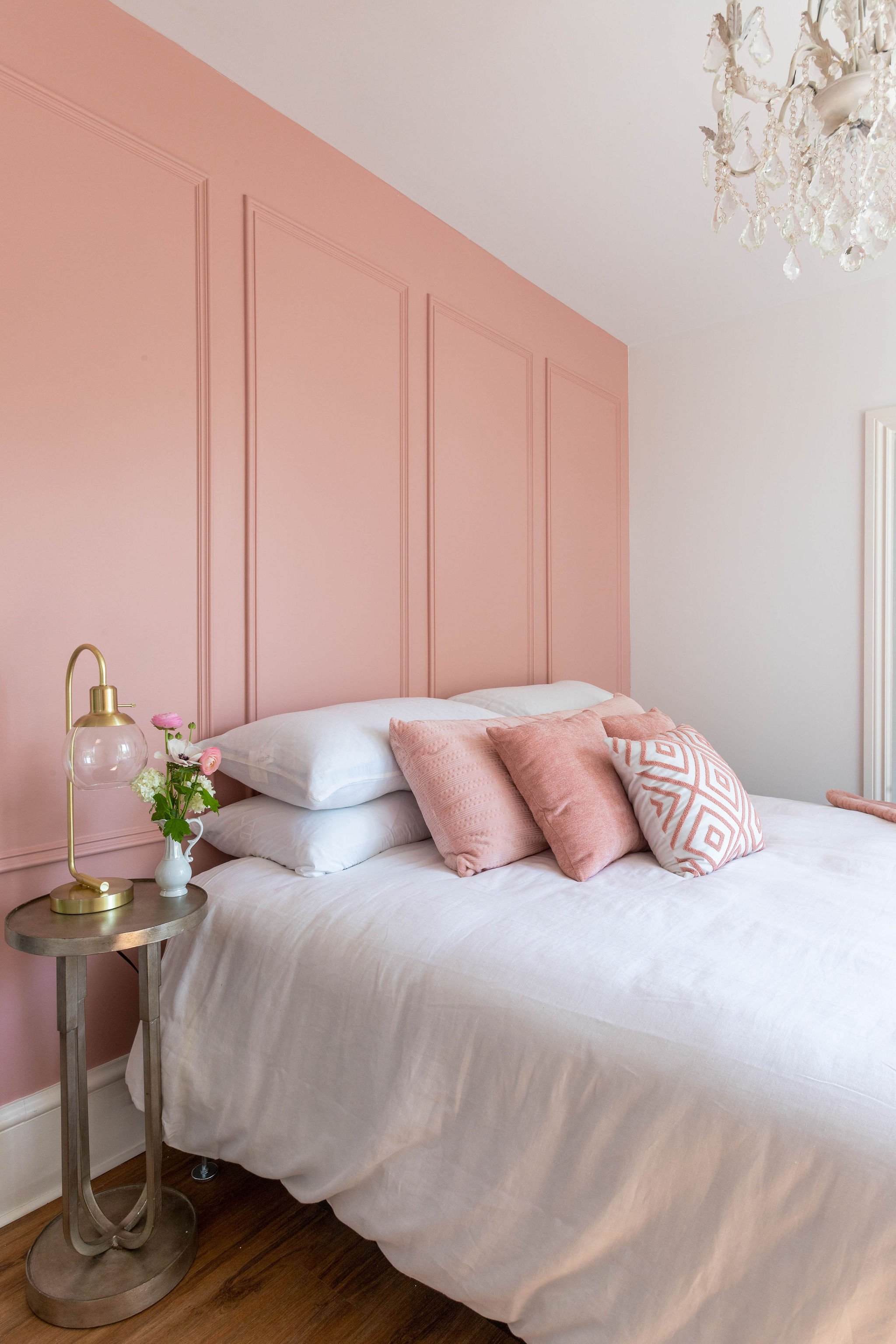
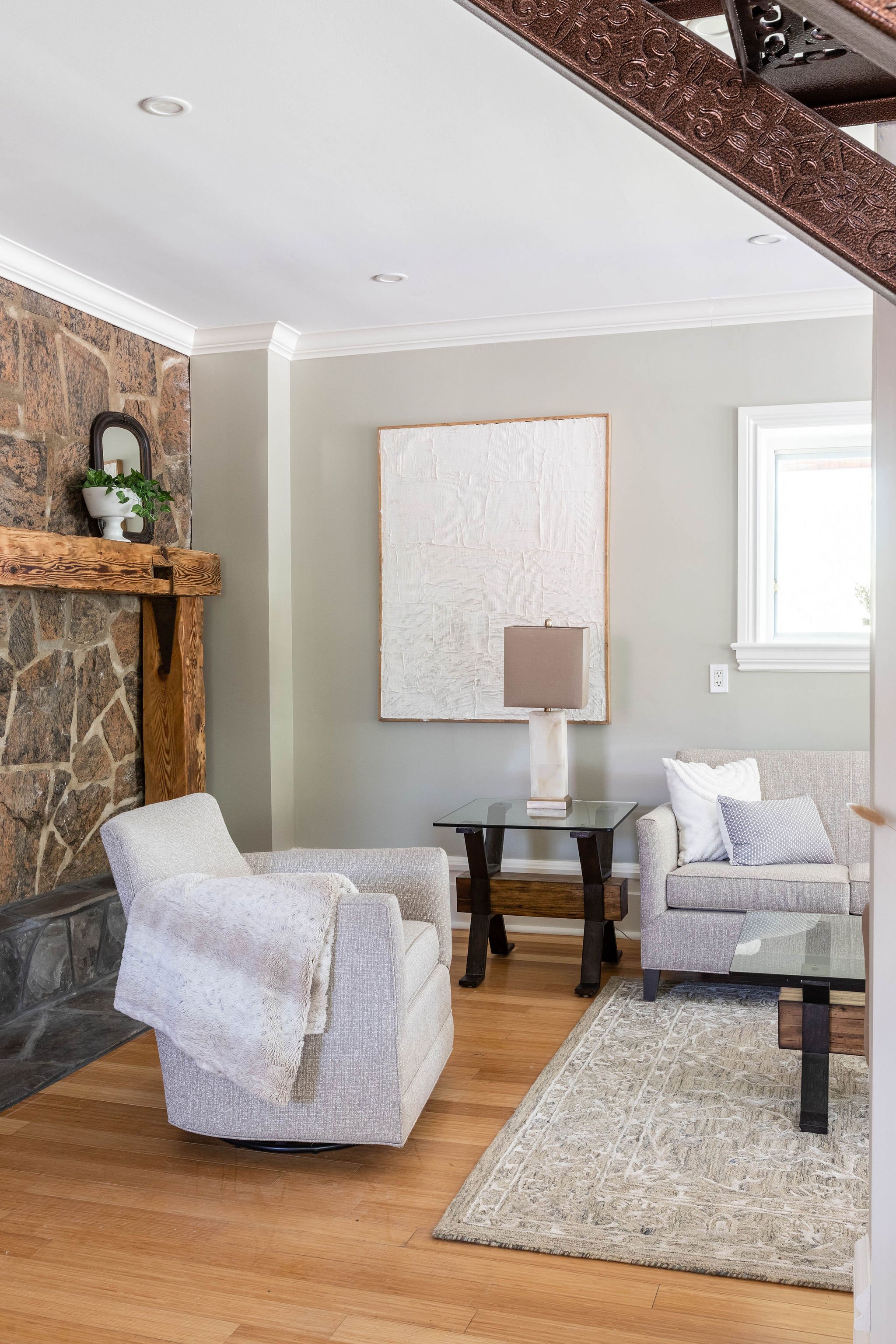
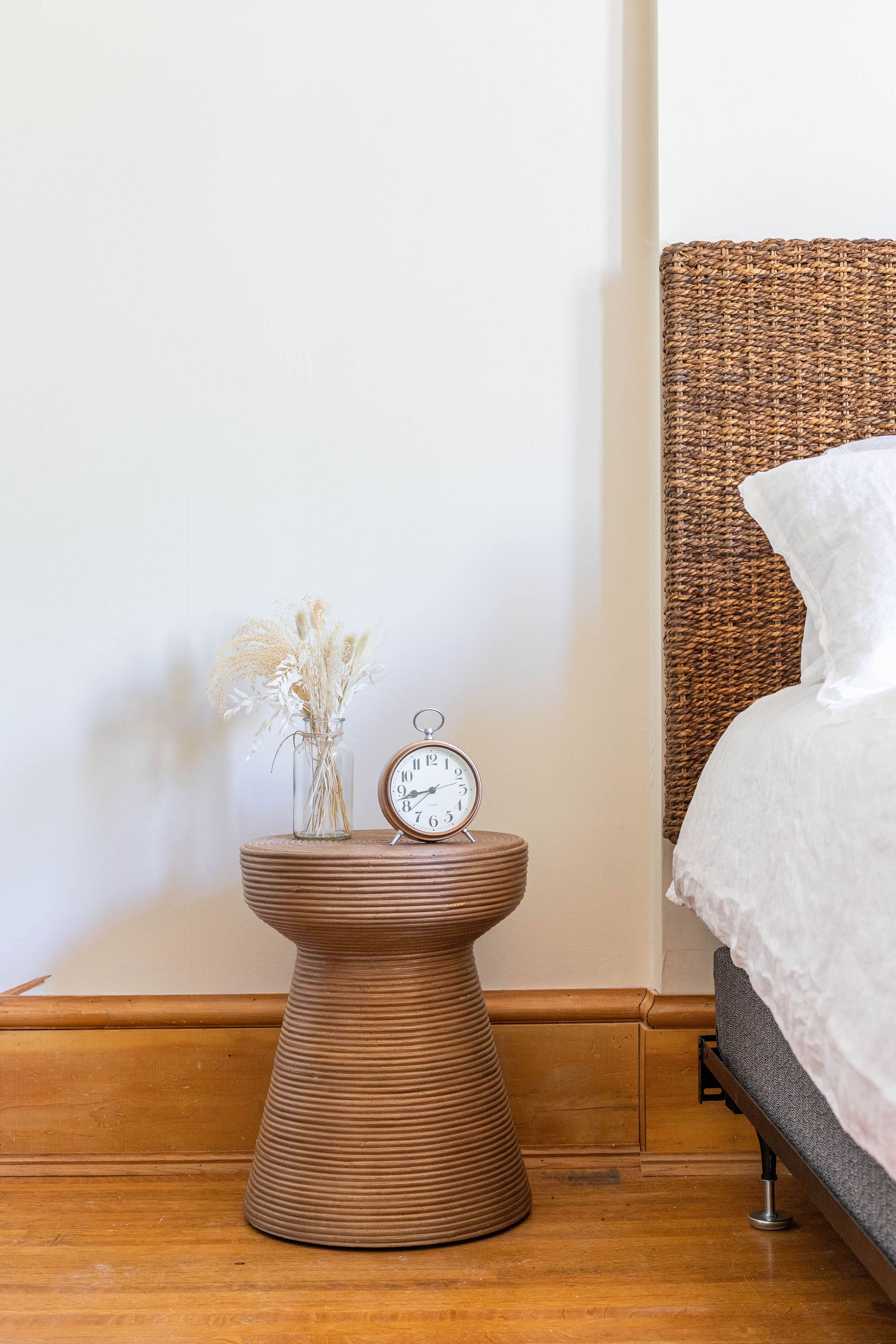
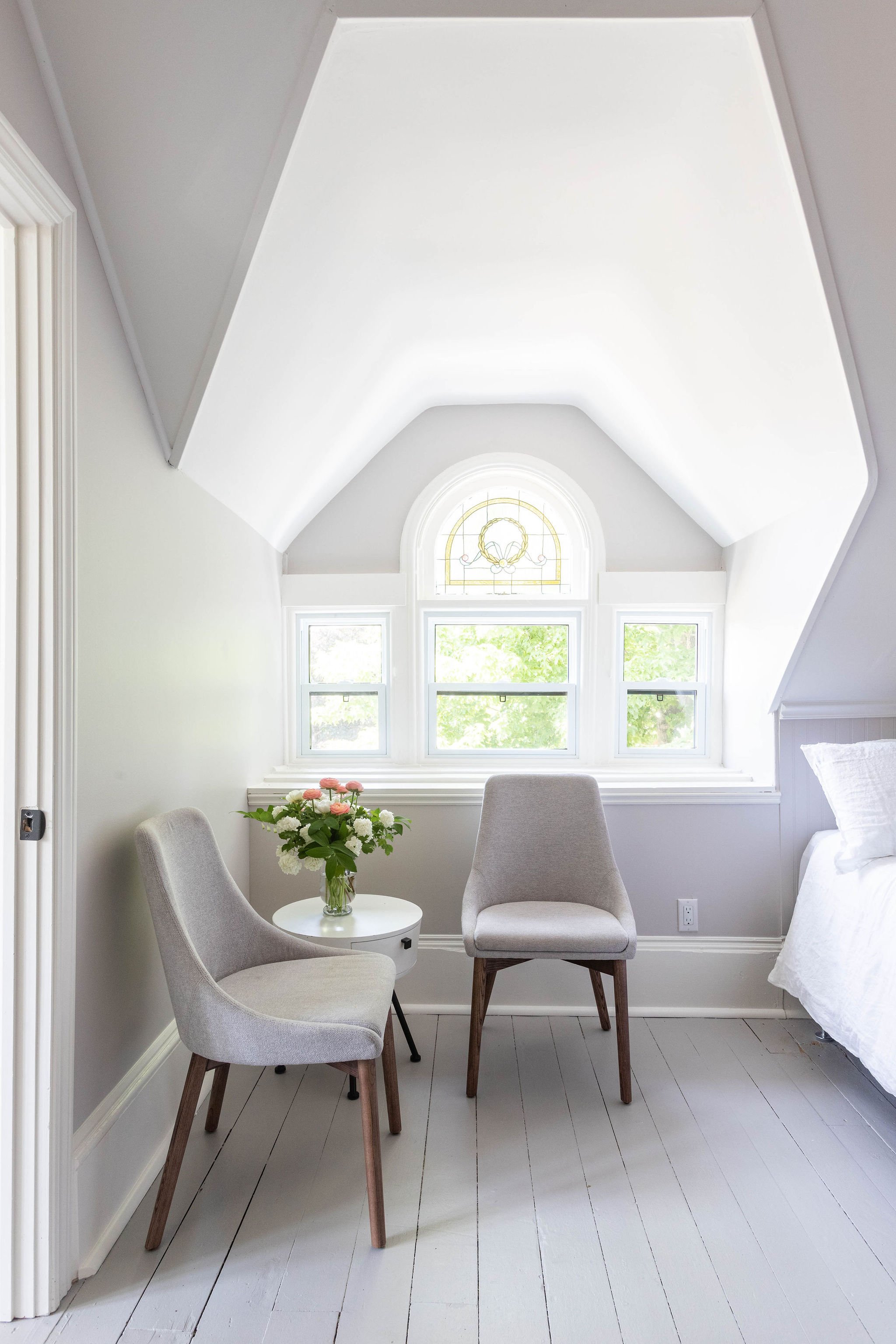
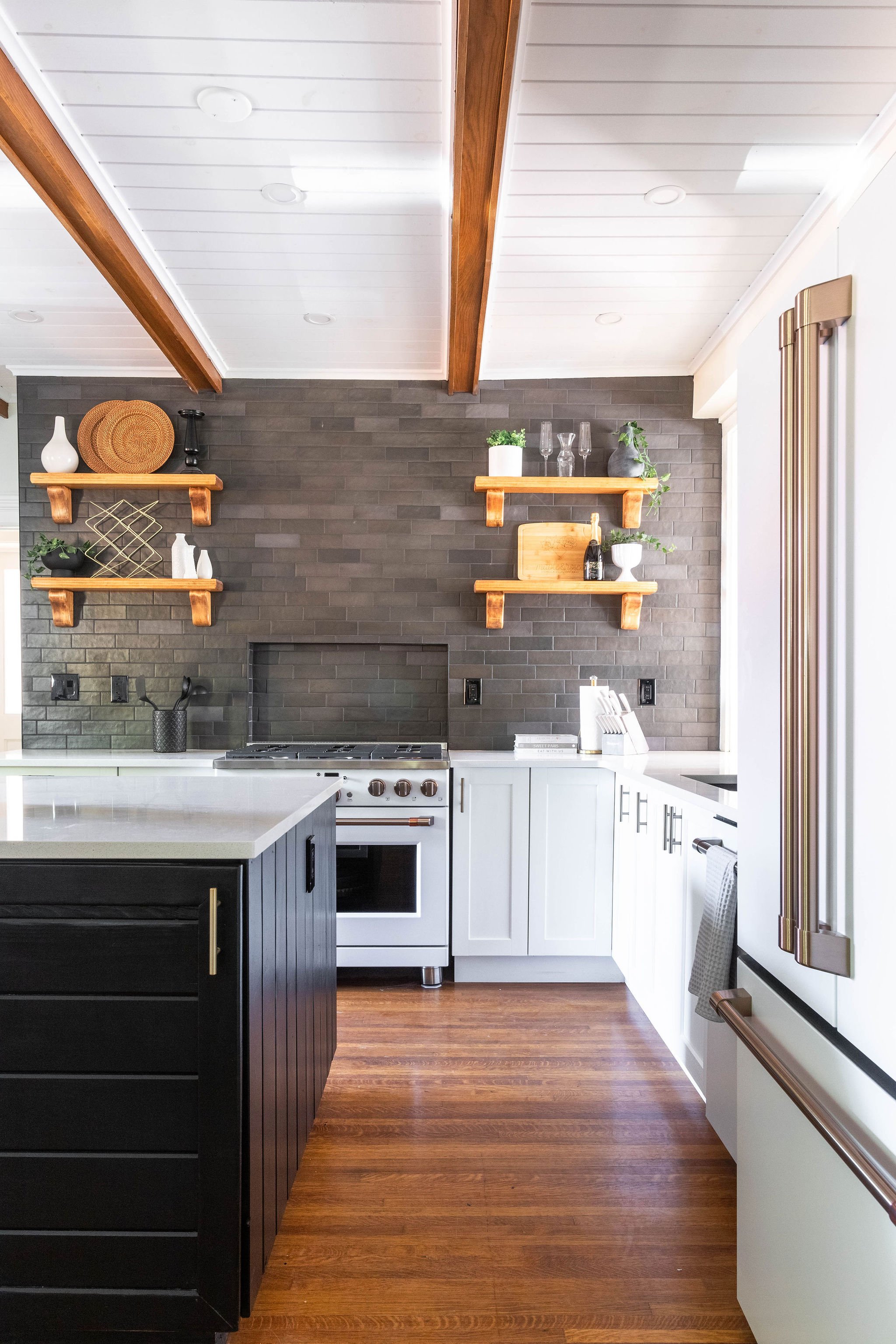
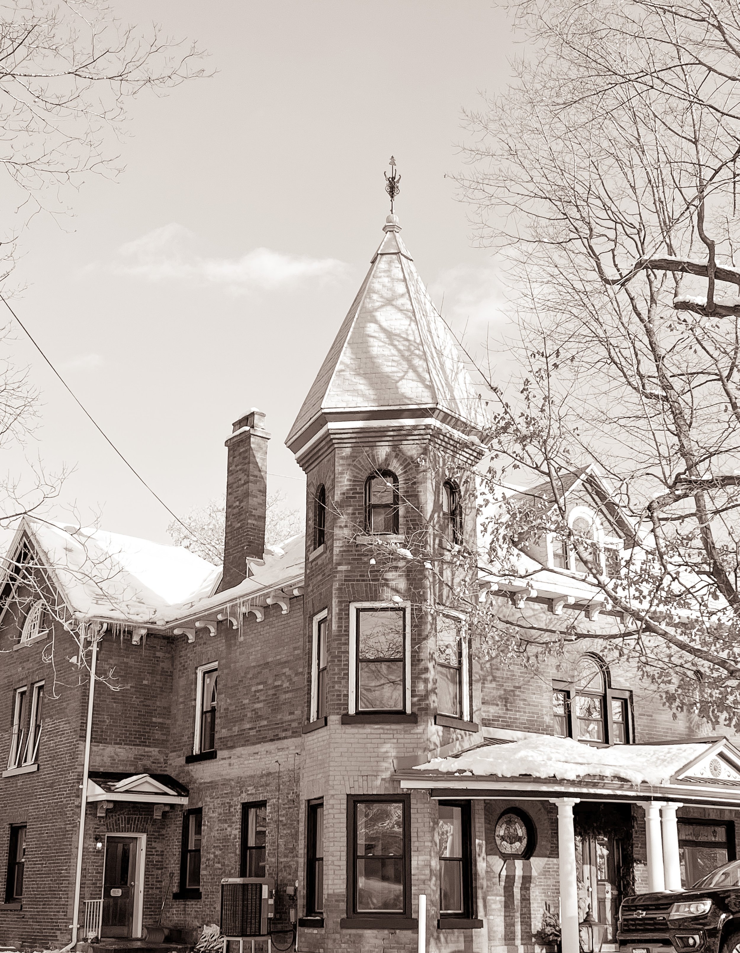
When I first came across Maple & Rose on Instagram I felt an instant connection, I loved the way historic elements were being honoured while they brought this whole home rental to life with luxurious finishes and stories tied to the community of Merrickville. To be honest, that was the part that I connected with the most - the stories, the historic finds and the way daughter and property manager Kate Folk was bringing everyone along the journey of uncovering these pieces of historic evidence from the 1840’s home.
When Kate reached out to connect with me about branding for Maple & Rose something sparked inside of me - I was so excited about the opportunity to work on such a unique and historic project. Furthermore, I adore Merrickville and I grew up frequenting the small shops and local restaurants with my mom. It holds a special place in my heart, and to work with a local business honouring a stunning home within the area - well it felt like the perfect fit.
That first discussion led to me asking where does the name Maple & Rose come from, to which Kate explained that the late patriarch of their family was the strong maple, while her mother was the rose. This further indicated that the family had put so much thought into the business name, and ensured that it tied into a brand story that everyone could connect and fall in love with - which left me even more excited to bring a visual brand to life for this family.
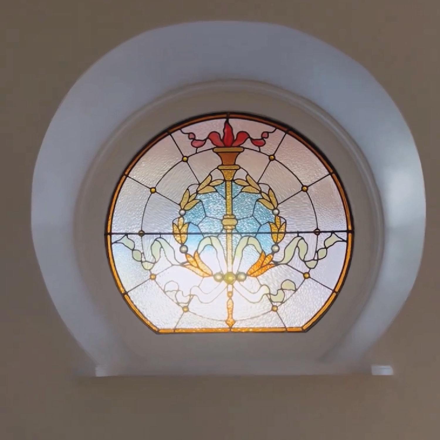
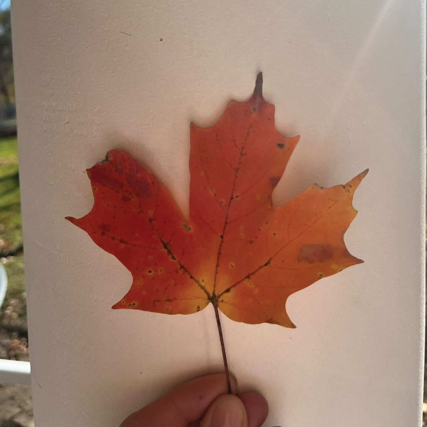
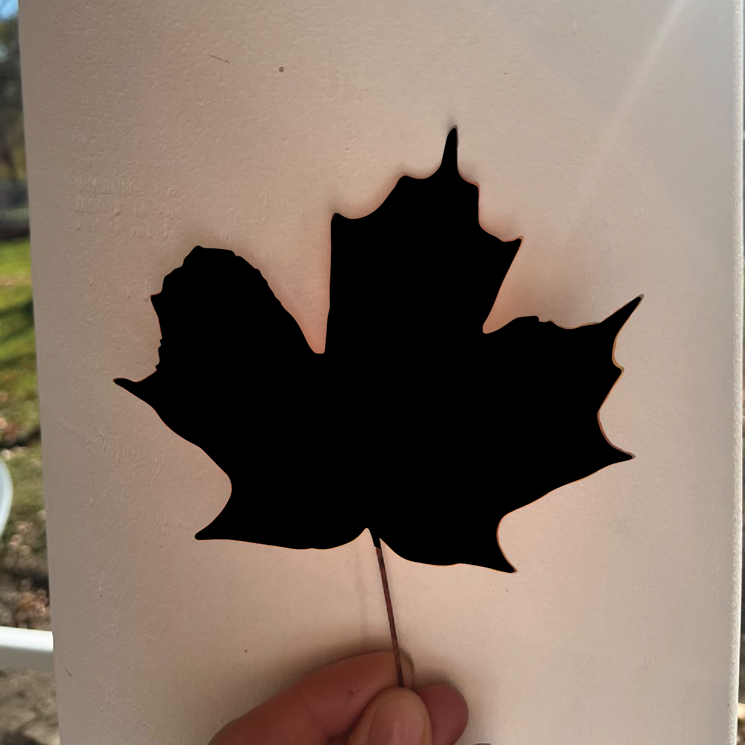
Fast forward to market research, brainstorming and trying to develop strong enough concept ideas that would showcase the historic and family elements tied to the Maple & Rose brand, I requested that Kate send me a picture of an actual maple leaf from the property, and I loved the oval / circular shape of one of the windows specifically and was trying to pull elements together. That being said I was missing something and I sent Kate an email telling her to give me a few more days to explore some more ideas because something was nagging at my creative abilities and telling me I hadn’t come across the right inspiration yet…
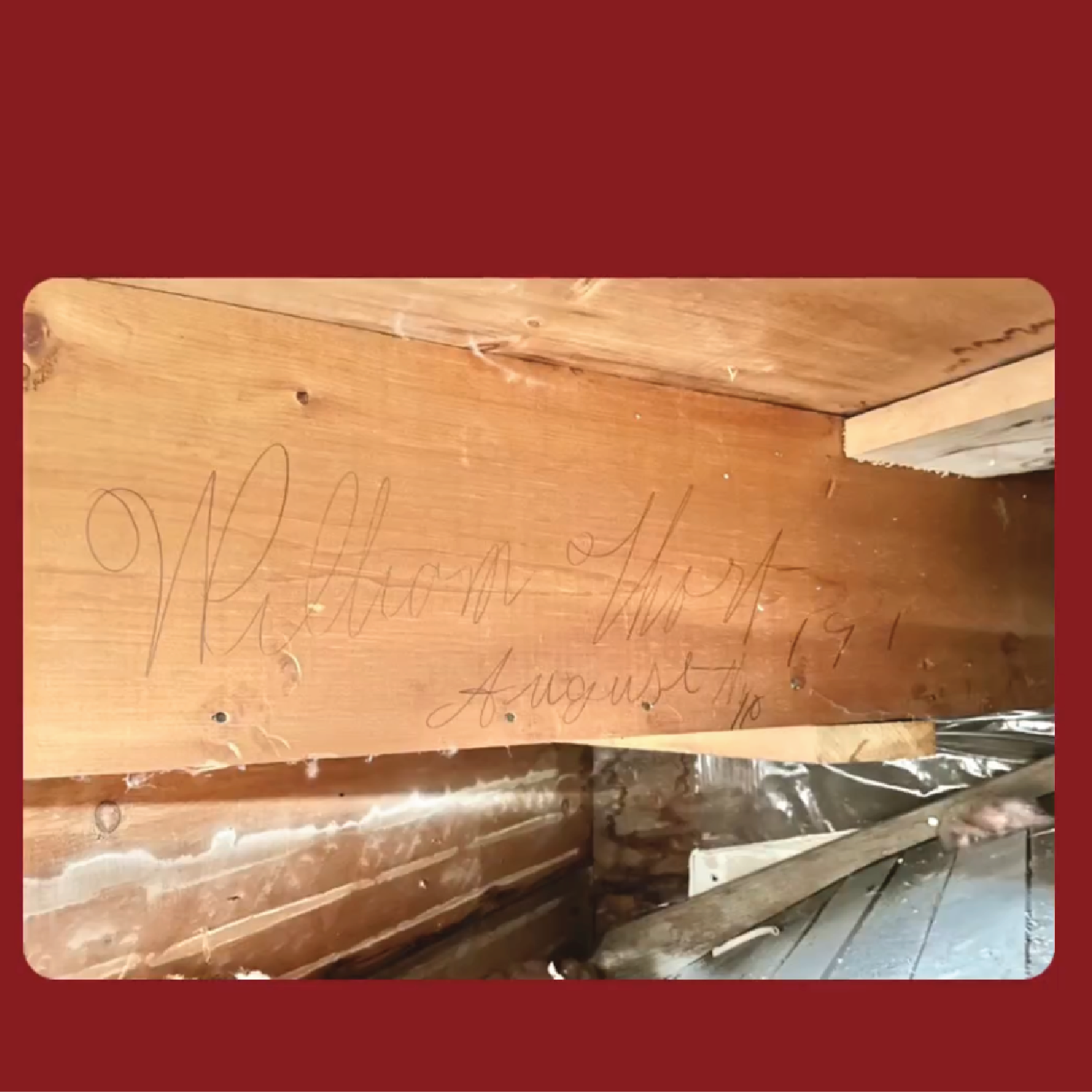
I didn’t know the next part of my design direction, I was searching high and low, I was zooming in on pictures of wallpaper that Kate had uncovered and shared with her followers, I was trying to find more inspiration in the windows, in the doors, in the walls and then it happened!
The lead contractor on the M&R project was renovating the staircase that led to the third floor of the home and he uncovered a signature on the stairs. Kate shared this on social media and my designer heart sang. It gets even better though, it was soon discovered that William R. Thorpes was born in Ontario on March 17, 1862. He was a carpenter in Merrickville, Ontario and it is believed that he was the carpenter who completed the third floor addition in the late 1800’s. I was so inspired by his signature and wanted to honour the history and all of the contractors that have continued to play a part in the beauty of this Heritage home - wait for it!
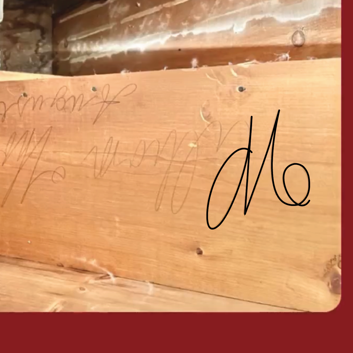
Upon seeing the signature, I immediately recognized the potential to incorporate the initial "W" into an "M" for Maple, symbolizing the heritage of the home and paying homage to the skilled craftsmen who contributed to its beauty over the years. This transformation of the letter showcased my desire to honour the history and legacy of the contractors who had played a vital role in the construction of the residence. I flipped that signature and traced the “W” and created the “M.” In addition to the "M" monogram, I made sure it was seamlessly connected to the letter "R" representing Rose. This connection signifies the union of Maple and Rose, blending the historic aspect of the home with its present identity.
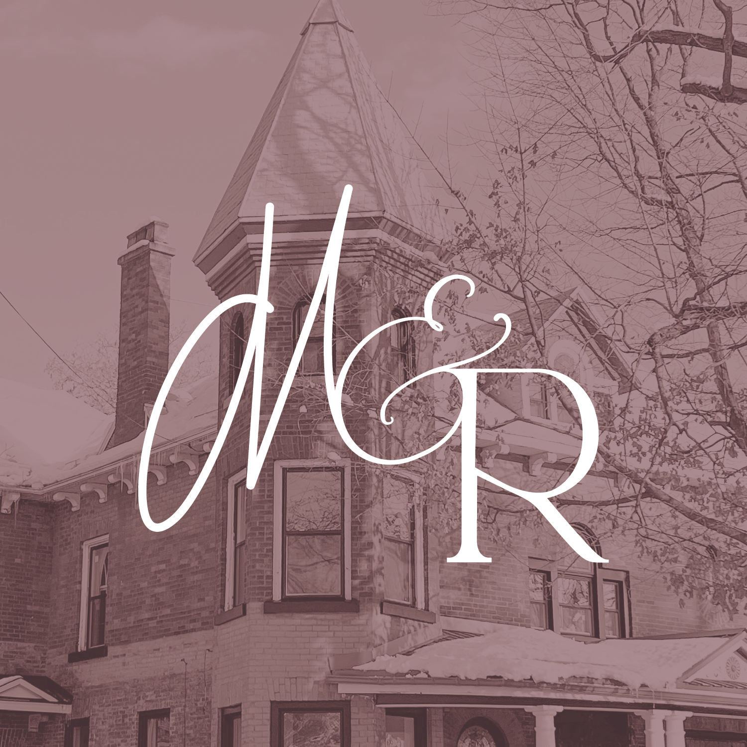
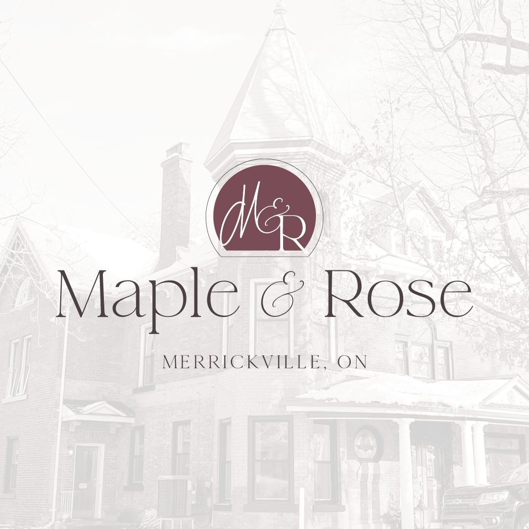
The unveiling of the monogram design was met with awe and appreciation from the community. The tie to William's signature captivated the residents who were invested in the discovery and historical significance. By immortalizing William's signature within the Maple & Rose monogram, I was able to preserve this important piece of Merrickville's history for generations to come. Furthermore, I designed a variation of the monogram enclosed within a circular shape with a flat base. This design was inspired by an original window found in the home, further emphasizing the connection to the heritage and architectural elements of the property. The circular shape adds a sense of unity and timelessness to the monogram, symbolizing the enduring legacy of Maple & Rose.
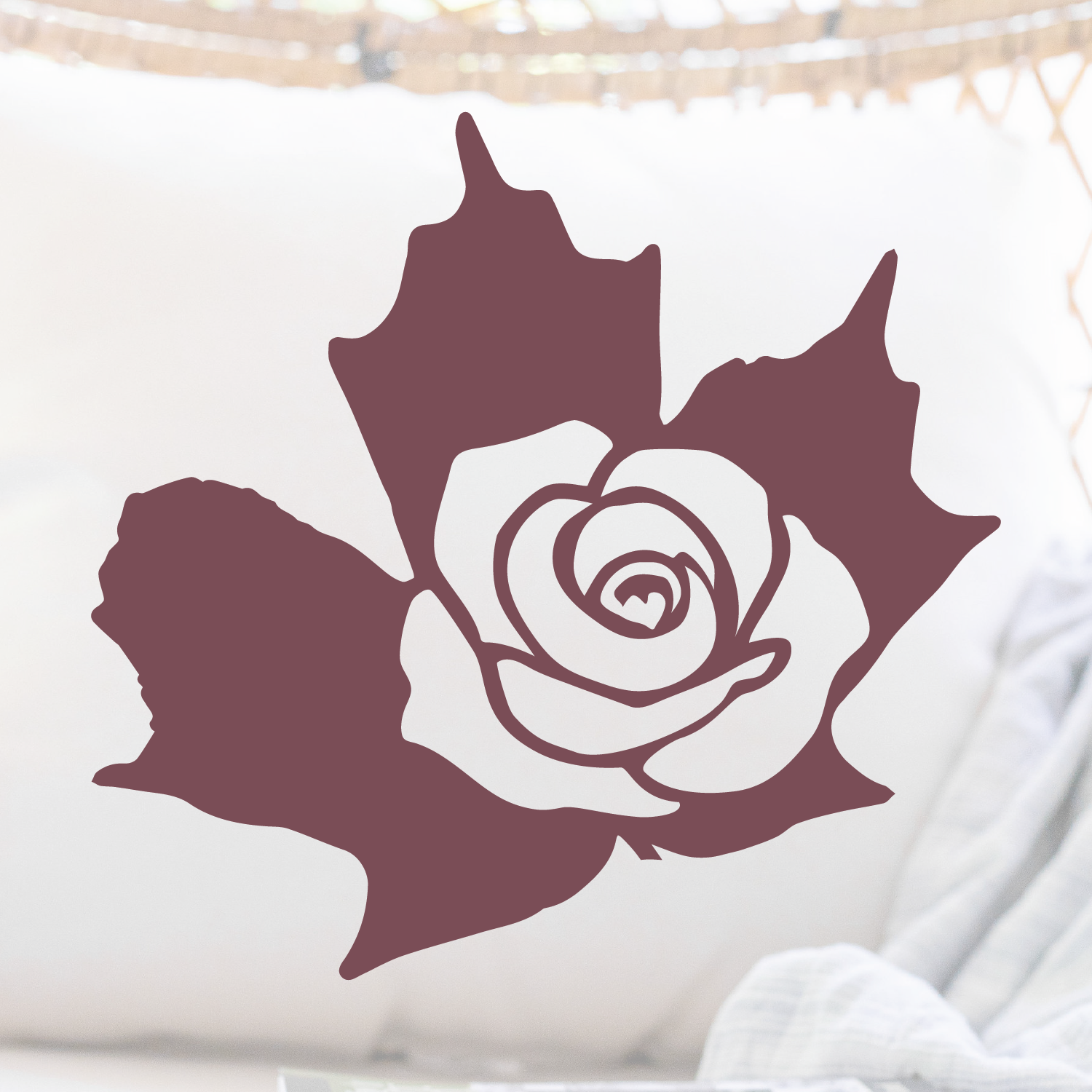
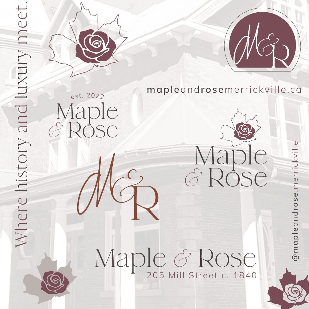
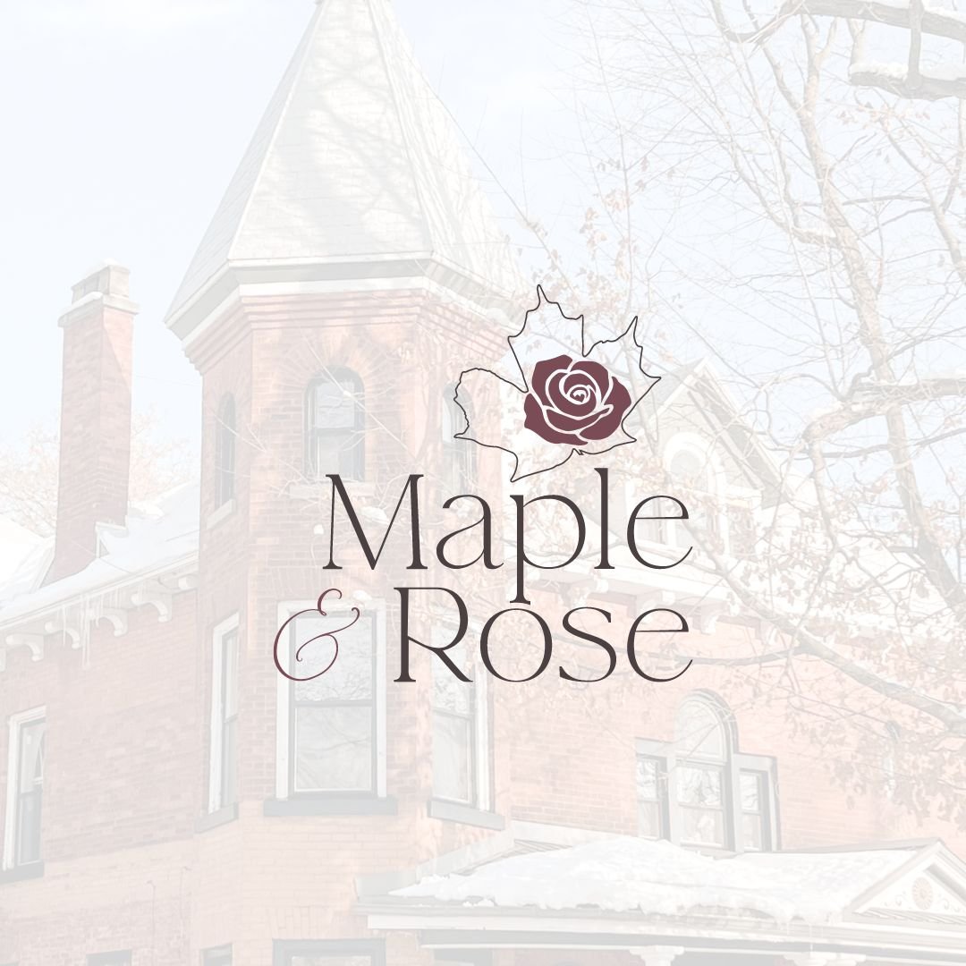
There is also a submark that was created that traced the maple leaf that was mentioned at the beginning, with imperfect edges that tie into the history of the home and represent the family’s late father ‘The Strong Maple’. The rose has seven petals to represent the number of rooms at Maple & Rose. Within the rose (look closely) there is an extra petal that ties into a heart; this represents the love between the family’s Maple & his Rose. It symbolizes that while they may have lost their ‘Maple Tree’, he reamins attached to each member of their family.

Brand design by Sweeney curations


Brand Photography captured by the talented Tania Blake

To follow along with Maple & Rose on Instagram be sure to check them out here!