Valley Wellness & Nutrition Rebranded
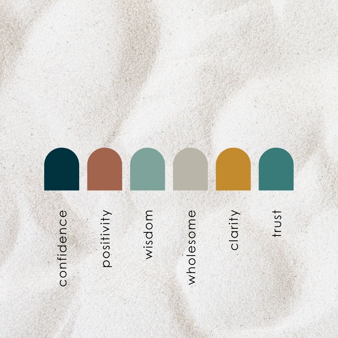
This rebrand was packed with reworking wording for impactful brand strategy, layering elements into the visuals that have hidden meanings and going against the grain of the typical wellness industry colours.
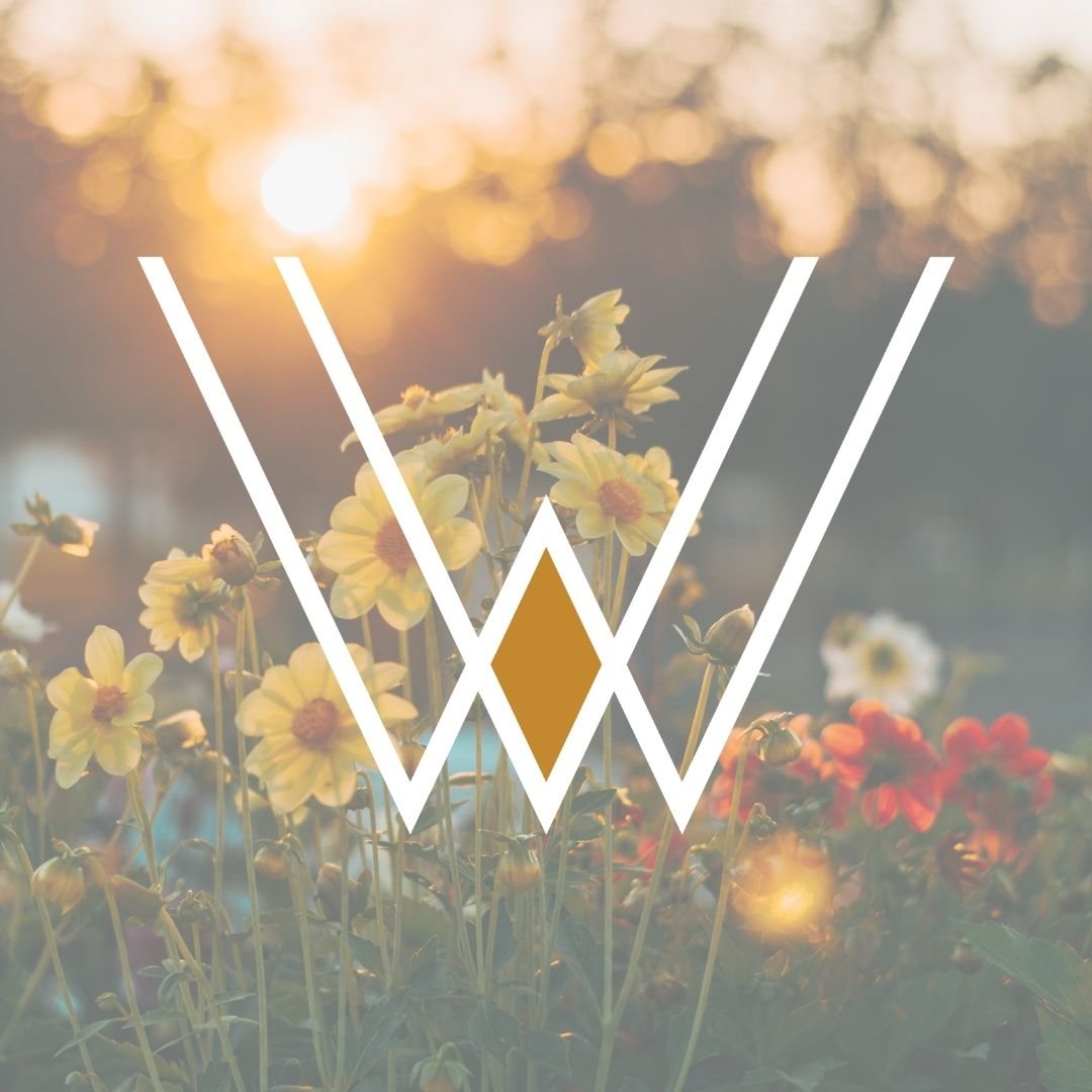
The ampersand (&) was hand selected by the owners son, which tied into the importance of family. The wordmark has customized characters to showcase the flowing of water, varying widths to signify the balance and symmetry that may never be found in life but with VWN’s guidance - you can feel more balanced. And the spacing is intentional to provide a feeling of breathability within the design itself.
The focus on the simplistic linear design connects a V W and N together, while the N leans slightly towards the right to represent goals of moving forward. The overlap forms a diamond shape to represent the clarity that this company brings to corporations, working professionals & individuals seeking to better their lives, feel less stressed and have more energy.