Twig + Timber Interiors Rebranded
We created a new & timeless look for Twig & Timber Interiors and the feedback has been incredible. Owner and Lead Designer, Stefanie Seguin is celebrating 18 years in business and she decided to invest in a rebrand that would elevate her visual identity.
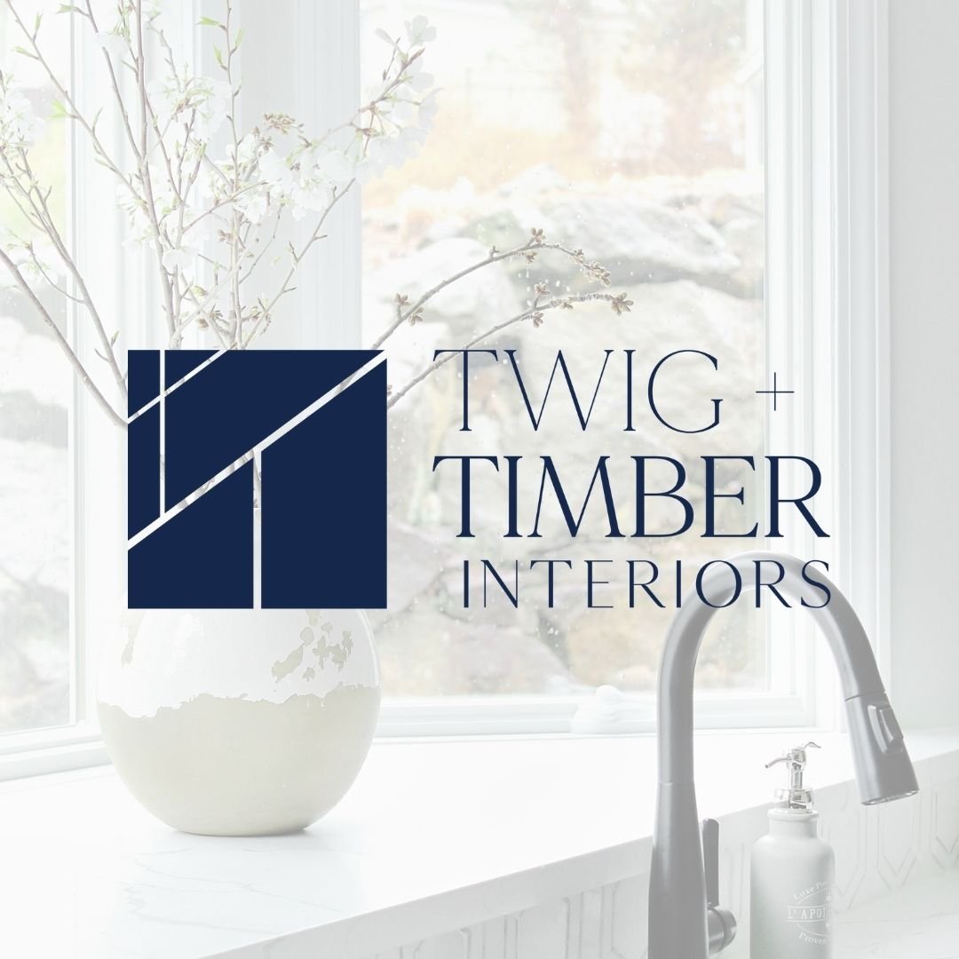
The primary logo was developed to symbolize the true meaning behind Twig + Timber Interiors and that is to represent both small and larger scale projects in a modern and professional way. Both the icon & the wordmark showcase a linear design that is both thin (Twig) and thick (Timber). The icon also represents different sized spaces within all of the various shapes formed within the icon. Oh, and our favourite detail, look closely…Do you see the subtle outline of the homes?! There was an intentional reason those T’s were angled!