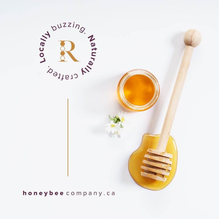
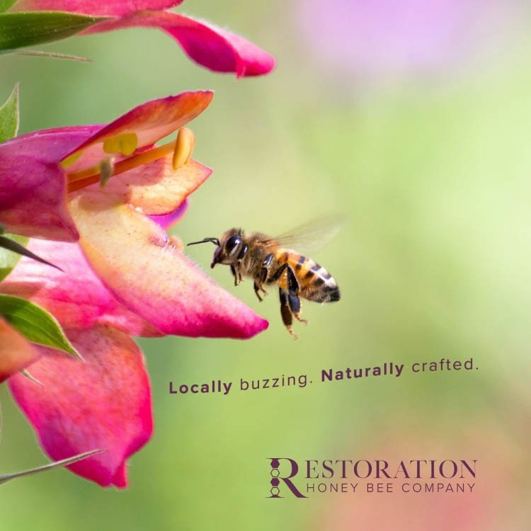
Restoration Honey Bee Company Rebranded
Teaching courses on their own and through a local college, the Espadero family is well versed and always continuing to learn about the welfare of the bees and honey production. Requesting a branding that was both classic and progressive all tied into one, we created an iconic and competitive visual identity for this incredible family of passionate beekeepers. The slogan taps into local, family, nature, beauty and allows for expansion and interpretation from both an educational front and their product line.
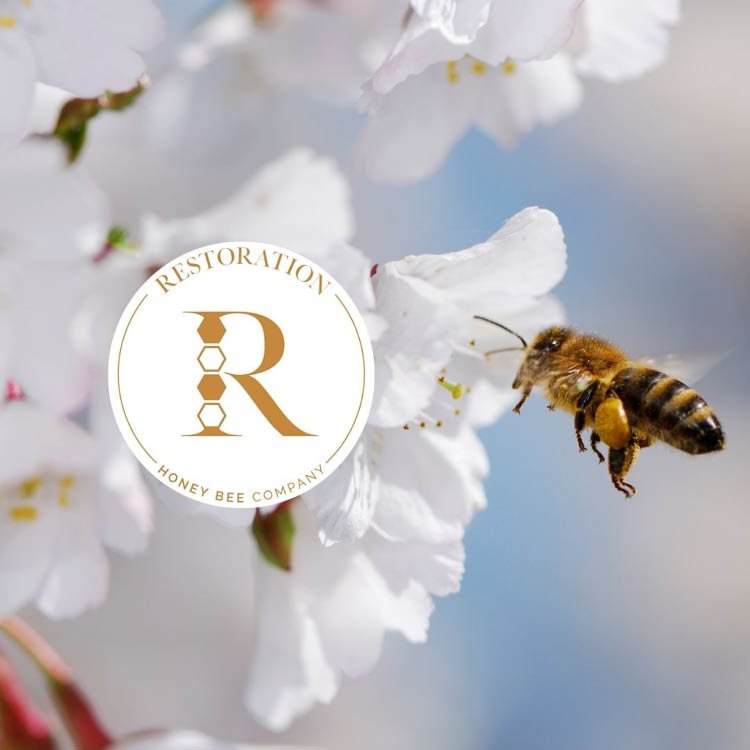
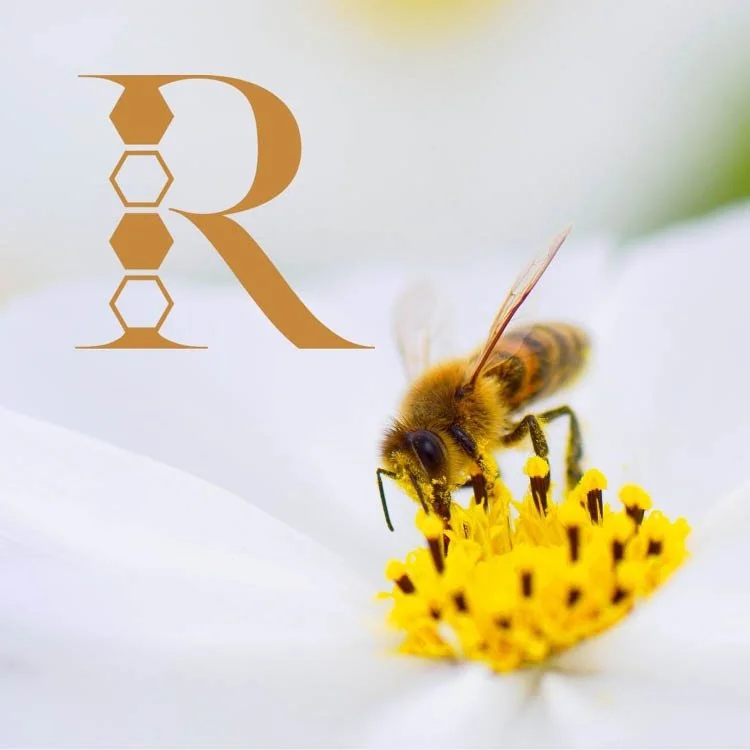
The primary logo was developed to incorporate four honeycombs into the iconic ‘R’ representing RHBC. The four honeycombs are symbolic of four little beekeepers (The Espadero children), the four seasons and the four steps to bees making honey; collecting nectar, passing the nectar to the house bees, bees dehydrating the honey and bees capping the honeycomb with beeswax. The colours are rich and prestigious, with ties to the Queen Bee, monarch, etc. Please be sure to check out their incredible product line Restoration Honey Bee Company