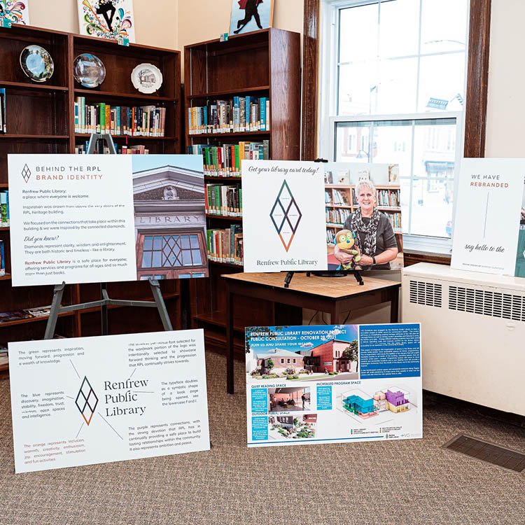
Renfrew Public Library Rebranded
To celebrate 100 years the Renfrew Public Library underwent an extensive rebrand that was unveiled at their anniversary celebrations. An incredibly progressive and historic library that is situated Downtown Renfrew, we created a brand that drew inspiration from above the very doors of their heritage building. The library is a place where essentially everyone is welcome and we continued to circle back to the entry point of the building, the place in which so many individuals have walked through and continue to enter. We focused on the connections that take place upon walking through these very doors and we were inspired by the connected diamonds that are above the doors.
A diamond represents clarity, wisdom and enlightenment. While diamonds are usually known for structure and order, having the four shapes attached represents the connections built and the community formed within the walls of RPL.
The key factor that we wish to ingrain within the community is the the Renfrew Public Library is a safe place for everyone, offering services and programs for all ages and so much more than just books.