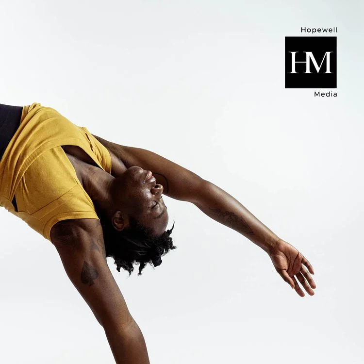
Hopewell Media Rebranded
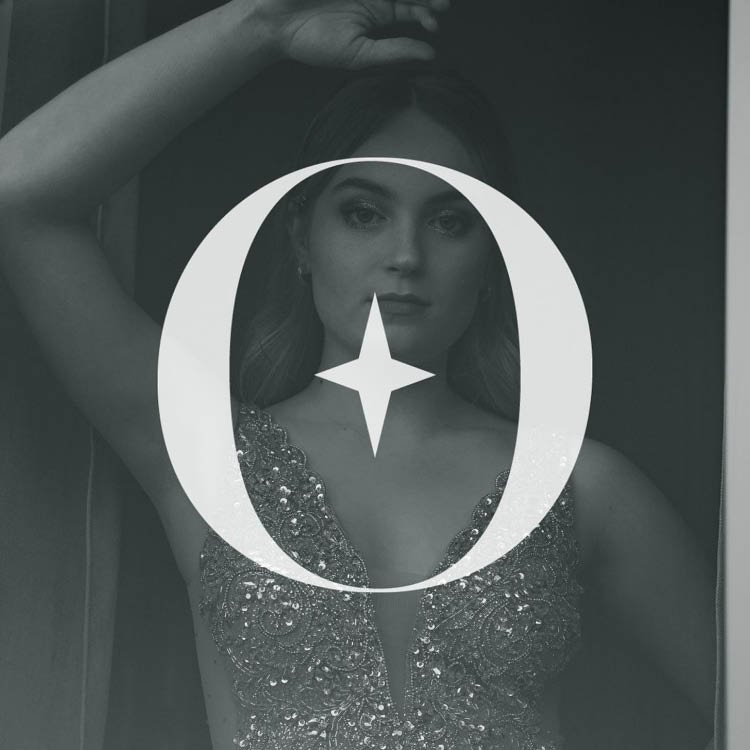
The incredibly talented photographer and videographer behind the lens, Rebecca Vandenberg owner of Hopewell Media hired us to elevate her brand and ensure it matched the high level of deliverables she was capturing for her clients. The primary logo was developed to incorporate the connection that Rebecca created within her community and anyone she works with. The attached and blended letter ‘HM’ represent that connection and the strong foundation of skills Rebecca demonstrates while shooting. The square shape symbolizes honesty and. the balance created in the photography process, while the circle with the star ties into her faith, the light settings for her camera and her grandfather’s car which provides familial ties to her business.
Did you notice that ‘WE’ is also attached as a nod to her collaborative approach?
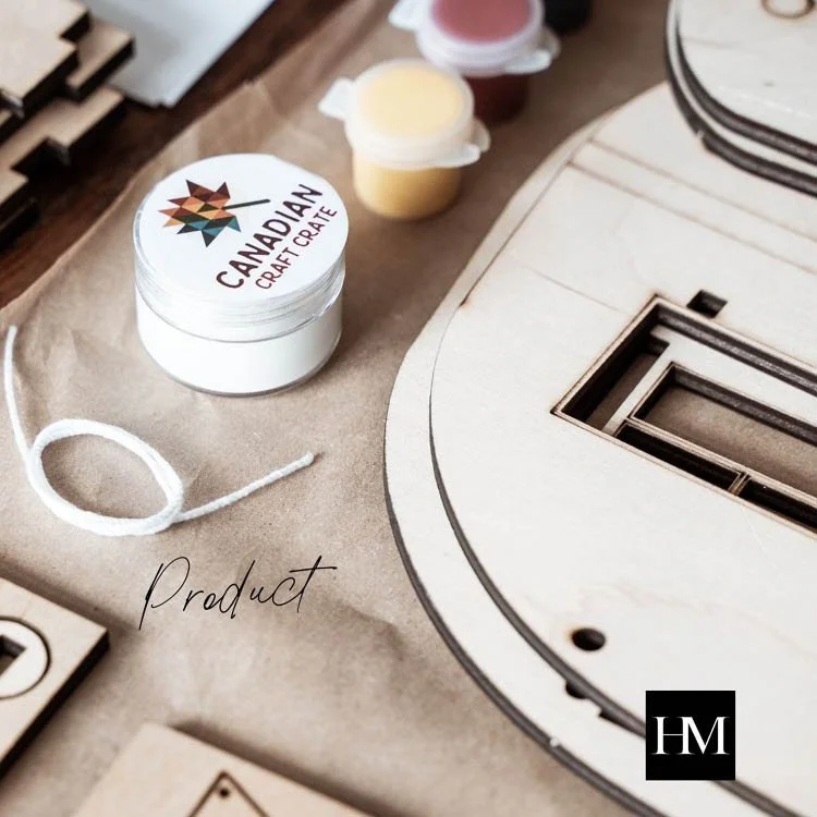
Be sure to check out her work over at Hopewell Media.